 So there it is, The Glove Box was screened last night at the Valley Art Theatre, one of 24 entries in the Phoenix Film Project 2004 Fall Film Challenge. We didn't win any awards, but it was cool to see the film on the big screen. The audience reaction was pretty good. Who knows, if Gabe and I had actually voted for our own film, we might have won something.
The other films demonstrated that there are a lot of creative people making films in Phoenix. I tend to always see the effort and creativity that goes into the work, even if the end result is not stellar. Bearing that in mind, I liked about 75% of the films screened. "Manscare" stood out as the most memorable film of the evening, a close-up night-vision of sheer terror in the face of banal activities, such as making coffee, and opening the fridge, with a highly original piano score. This film was totally unexpected and instantly lovable. "The Netherbeast of Berm-Tech Industries" won the competition, and was indeed the best directed, written, and acted piece of the night.
The other films showed a lot of creativity in the selection and composition of shots, overall looks, and others complex editing, some of them packing in scores to hundreds of shots in the three-minute format. It really brought into perspective areas that we need to improve on in the future, which I'll touch on later.
I got to catch (and Tivo) the piece that was done on the Arizona News Channel. Yes, there were John and I standing in line, and I walked behind an interview. Having been there to see what was behind the news coverage highlights just how out of touch and watered down local news really is. On the up side, they showed clips of a few films, and I was struck by the image quality of them all. The projector in the theatre really mangled the images, resizing and causing all sorts of weird banding effects. At times it didn't seem the films were even running at full frame rate.
OK, so on to some constructive self-criticism. That's self-crticism, because even though this was Gabe's movie, I was there for the duration and could have provided more constructive input throughout. I'm sure Gabe can take it in the best way. We can only get better at this by being honest with ourselves. Seeing our film side-by-side with others highlighted areas we can improve in. So, here goes.
- Look - The look of The Glove Box was the absence of any kind of look. We shot with the goal of getting the best possible pictures, consistent and lit as well as we could. Other than that, it was pretty straightforward, no special effects or filters. I think we achieved what we set out for, the finished product looks very good, the look is consistent, just not very interesting. There is a lot of room for creativity, and most of the other films did indeed have unique looks that had to be planned out and thoughtfully executed.
- Shot Selection - Again, we stayed fairly conservative in this regard. The shots we did told the story effectively, but nothing really jumps out as very agressive, creative, mind-blowing, etc. The time lapse got a decent reaction, but it was subtle enough that you might not have noticed it. Perhaps it could have been accentuated by a sound effect? The slow zoom back and forth between Gabe and The Glove Box was nice and the switch to handheld for the climactic scene were effective, but very subtle.
- Editing - The editing was very natural. The performance flowed and was consistent from shot to shot, such as the interior car scenes. However, the editing wasn't really out of the ordinary or agressive. The "Homocide: Life on the Streets" homage during the first scene, in which Gabe pulls the door handle a number of times from a number of angles was actually so fast, I don't know that anyone could catch what was going on. The final scene with Gabe in the car was timed and executed well, and that was probably the most important scene. The rest of the film could have been better, but only with more source material to work with, which would have require much additional forethought to shoot.
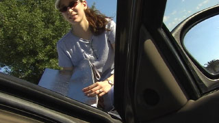
- Wardrobe - This is one of those areas where attention to detail can really set the production apart and create that elusive suspension of disbelief. In this case, I think if we had stuck to our guns and had Gabe dressed up in a real smart looking shirt and tie, very go-getter executive type, it would have been a very different production. Guys in t-shirts are a dime a dozen, sorry Gabe.
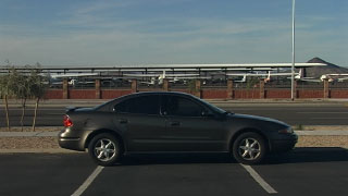
- Locations - Another key area. Some of the other films stood out because of the interesting locations or the lengths they must have gone to get a shot. The dunes in "Tempus Fugit", the lake in "I'm Dead", the carnival in "Lost Dreams" come to mind. Much like the last point, people's livingrooms, cars, and parking lots are a dime a dozen. When we do get to an good location, across from the airport, the whole scene is more interesting. Our parking lot was good for what we wanted to do, but if there were other things going on in the distance, it could have been a lot better.
- Music - We had some good music, and it fit well and enhanced the film. However, it wasn't a score per se, so didn't really hit all the points we would have wanted it to in a perfect world. The switch halfway through from one style to another seems a little drastic in retrospect. Maybe we could have faded up The Casket Lottery song a little slower.
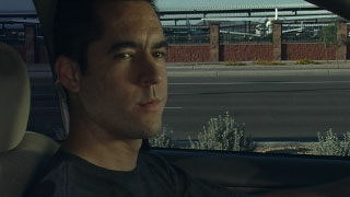
- Acting - I saved the best for last. Gabe's acting is probably what stands out the most. Having just a single line of dialogue, he uses subtle physical acting throughout to convey the mounting frustration and tension. It's a thing of beauty. He pounds a glove box like no one else.
Don't get me wrong, I'm really pleased with our film. I just wanted to illustrate that there is room to improve and really kick it up a notch on a lot of fronts. If we do this again, and I hope we do (we should each direct a short for the Spring challenge!), we should really be open to collaborating and encouraging each other to make every shot, every cut, every stitch of clothing, and every prop, the best it can be. Let's get crazy!
 The
The  Derrick and Amy Ross, AKA
  Yesterday I finished the final audio mix on
  How about the complete first season of
  We don't believe!? Ha! My reverse jinx worked out just as I had planned. The
  This project, which I assume will become another EP (as yet unnamed, but you can probably guess what I'm leaning towards), is in the extremely preliminary stages. I'm not even sure if it will come to fruition. For the time being it will have to be just research, research, research.
 The box is by
  Just wrapped on photography for The Glove Box. Got all the juicy close-ups, reactions, reverse angles, and menacingly slow zooms you could want in a three minute horror/suspense short. I learned that Gabe can say a single line thirty different ways. I figured out how to work the camera's remote wand. All in all, a good day.
 I was so tired last night, I accidentally clicked Save instead of Post...