Much of The Visitor story has already been related. A quick refresher: An alien (the outer space kind) is befriended by a pioneer (the Old West kind) family and all sorts of warm and fuzzy things ensue.
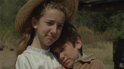
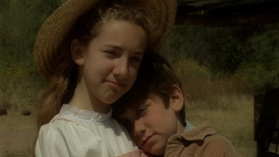
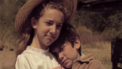
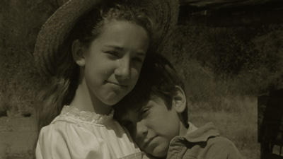
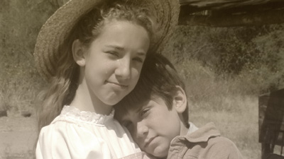
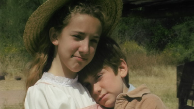
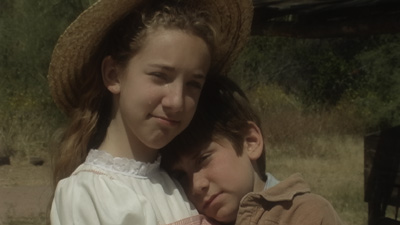
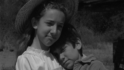
The purpose of this post is to get some feedback on the look of the film. It was intended to be sepia-toned, and I was supposed to shoot it in black and white and color it in post. Well, I negelected to activate the black and white feature, so I have color footage, which looks pretty darn good in color. So, the original vision has been brought into question somewhat.
With that said, I give you eight potential looks. Let me know what you think.
9 comments:
I vote for 2 or 3.
Six! Use six! It is my command.
My pick was 3.
6 is actually pretty nice too now that RGL mentions it.
First impression is 3 is the best if you're going non-color. 6 is really beautiful. Such clarity!
Pull the Chungking Express trick. Buy your girlfriend a chef's salad and tuna and see which she likes better. Do it both ways and see which you like better in the final product.
I did, I rendered it out both ways, but I still can't make up my mind. It's just a shame to throw away such great color. Decisions, decisions.
Post the two final products and we'll review for you.
Yeah, totally.
Hold up, I still have to finish the edits.
Post a Comment